
In the Muggle World, What Are the Demographics of the Hogwarts Houses?
Gryffindors are brave, Ravenclaws smart, Slytherins evil, and Hufflepuffs miscellaneous. This much we know from the Harry Potter books. What we don’t know is the makeup of each House in terms of its demographics. Which House is for the rich? Which House has the greatest diversity? Is there a gender imbalance per House? Are Slytherins really as ethnocentric as they appear in the books? Are Ravenclaws as intelligent? So many unanswered questions.
Fortunately, I conducted a survey1 that can start us on the road to answering these truly important questions. Let’s start by looking at the overall distribution of House placement.
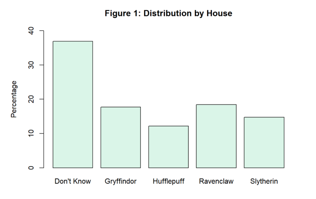
Remember that these are self-reported ratings of which Hogwarts House respondents belong to, so in a way, it is answering the question of which House they want to belong to. The modal response is that they don’t know. Among the rest, unsurprisingly, Ravenclaw is the most popular response. Everyone wants to believe they are intelligent. Gryffindor is next. Again, no surprise given the laudatory way in which Gryffindor is described in the books.2 Hilariously, more people would rather be in the House that is considered to be pretty much evil than be in Hufflepuff. Overall though, I was surprised how we ended up with a fairly evenly distributed sample across each of the four Houses. I would have thought there would be way more Gryffindors and Ravenclaws than Slytherins, for example, and not just a slightly superior number.
Now let’s take a look at gender and ethnicity.
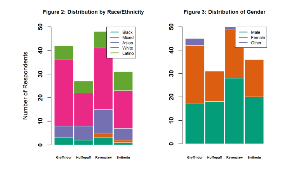
Fairly even in terms of gender distribution per House; although, women seem disproportionately drawn toward Gryffindor. There is some precedence for this: They somehow sucked Hermione Granger into their House even though she is clearly a Ravenclaw.
Also fairly evenly distributed in terms of racial and ethnic demographics.3 Gryffindors are the Whitest of the Houses (about 74%), while Slytherins are the most diverse. Asians in the sample are more than twice as likely to belong to Ravenclaw as any other House.
How about income?
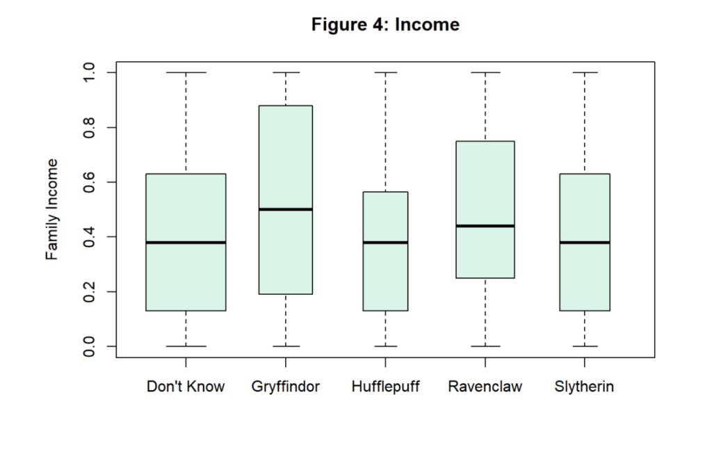
The Y-axis on this boxplot4 chart may need some explanation. Family income was measured on an eight-point ordinal scale, which was subsequently reordered along a 0–1 scale. Zero represents a family income of below $25,000, while one represents $200,000 and up. Gryffindors (the richest of the Houses) had an average family income of 0.53, which would be somewhere around $125,000. Hufflepuffs, in contrast, only make somewhere between $75,000 and $100,000.5
Now let’s think about ideology. In the books, Slytherins are portrayed as conservatives. They resist change, favor the “old ways” of organizing society, and are generally supportive of aristocracy and unsupportive of opening opportunities to non-pure-blood wizards. Let’s see if that holds up in the data.
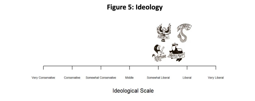
As you can see from respondents’ self-reported placement on a left-right ideological scale, Slytherins are actually the most liberal House. Gryffindors are the most conservative; although they are all bunched quite tightly between “somewhat liberal“ and “liberal.“ Given that my sample is overwhelmingly liberal to start with, the absolute placement of the Houses is, of course, less revealing than their position relative to one another. Even compared with each other, though, there is little variation among the Houses, and hence my helpful little House logos I drew had to be resized to be quite small indeed, robbing the world of seeing my true artistic talent. You can hardly see the intricate pattern on that snake. 🙁
Now let’s look at religious affiliation (and lack thereof).
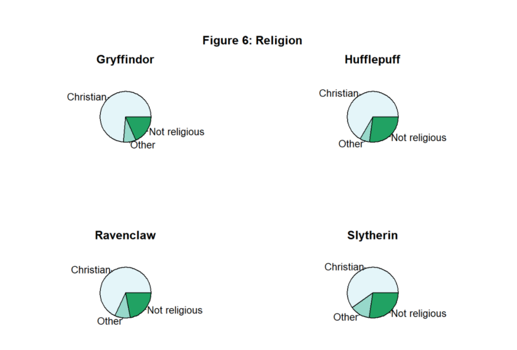
It’s fairly similar across the Houses; although Slytherins are the most likely to report being irreligious, agnostic, or atheist. Makes sense, right? I imagine trying to take a Slytherin to church would be like this iconic scene from The Omen.6
Next up: smarts. A common article of faith is that Ravenclaws are smarter. Does that hold up in the data? Well, I have only the roughest way to attempt to test this. The survey included a battery of questions about political and geographic knowledge.7 I have scored respondents’ answers to these questions on a 0–1 scale, which I’ve given the very ostentatious name of the “Geo-Political Knowledge Scale.”8 A one on the scale means respondents answered every question correctly (of which there were surprisingly many such respondents), and a zero would mean they answered every question incorrectly.
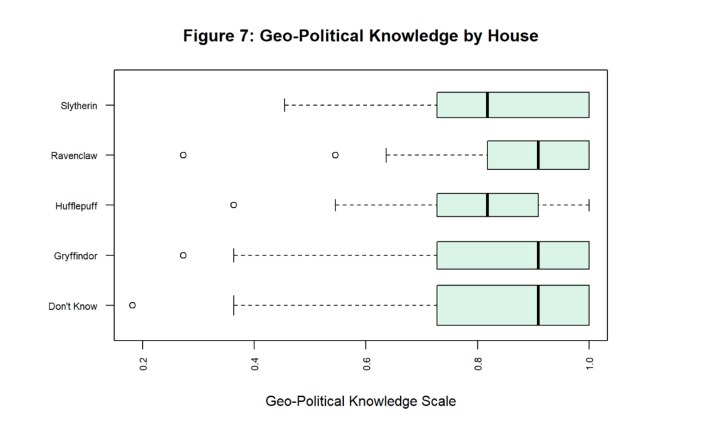
Figure 7 shows that Hufflepuffs perform the poorest when answering these questions, and Ravenclaws perform the best. That’s good news for Ravenclaw’s claim to be the smartest House… at least they can correctly identify countries on the map and know a little more about basic politics. Of course, the gap is teensy – Ravenclaws perform only about four percentage points better than non-Ravenclaws,9 but at least the relationship is in the expected direction.
Now let’s take a look at ethnocentrism. This is an area of scholarship that holds a lot of interest for me personally. In fact, I wrote my master’s thesis on the role of second language acquisition in moderating ethnocentrism. Ethnocentrism is just the tendency to prefer one’s own group to all other groups. For this survey, ethnocentrism was measured using Donald Kinder and Cindy Kam’s abbreviated feeling thermometer method as outlined in their excellent book on ethnocentrism Us Against Them. Respondents were asked to rate different groups (in this case, racial and ethnic groups) on an imagined “feeling thermometer” where 100 degrees means they feel very favorably toward the group(s) and zero degrees means they feel very coldly toward the group(s). To obtain an ethnocentric score, the average of the scores respondents give to outgroups are compared to the scores they give to their ingroup. The House I’m especially interested in looking at is Slytherin. In the books, Slytherins are almost ethnocentric by definition, in that they prefer pure-blooded wizards and would restrict membership in Hogwarts to exclude all those who do not fall within that category (i.e., those they call “Mudbloods”). Does that hold up in our data?
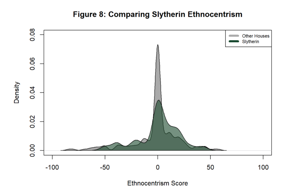
Somewhat. The density plot10 for Slytherin certainly encompasses more values to the right. Remember that scores to the right (i.e., bigger numbers) mean that a person is more ethnocentric – they give higher scores to their ingroup than to outgroups. On average though, a Slytherin is only between two and three percentage points more ethnocentric and statistically indistinguishable from zero. The direction is right, but the magnitude is negligible. I’ll bet “Mudblood” isn’t even in their vocabulary. In fact, Gryffindor is technically the most ethnocentric House according to this data.
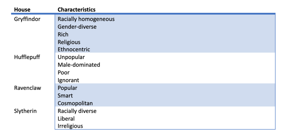
So what exercise taught us about the Hogwarts Houses? Here are the broad takeaways as I see them:
Of course, it should go without saying that this is a totally silly exercise that I did purely for a few kicks and giggles. The Hogwarts House question was just a fun attention check question in a survey designed for a totally different purpose – to assess the strength of regional identities. And all the relationships between Hogwarts Houses and the other variables are undoubtedly spurious. I see it as part of the same strain of “research” as the delightful study on how Nick Cage movies are correlated with the rate of people drowning. That being said, in my heart of hearts, I will still always have some mistrust of anyone who tells me that they are a Slytherin.
1 This was a convenience survey of 271 undergraduate students carried out in 2021 at a large Midwestern university. The survey was designed to measure political science variables, with a question about Harry Potter thrown in as a fun attention check. Specifically, participants were asked, “Which Harry Potter House do you belong to?” Participants received extra credit for taking the survey. In terms of demographics of participants, it was roughly split in half in terms of male and female participants, with only five respondents who marked “other.” The average respondent comes from a family earning between 75k–125k and is somewhat liberal. In terms of racial demographics, 58% of the sample were White, 6% Black, 12% Asian, and 12% mixed race. 21% of the sample also identified as Latino.
2 My own take on Gryffindor is a little different. What kind of a house only prizes courage? A house that is full of jocks, meatheads, and people with anger management issues. I would be embarrassed if the Sorting Hat said I belonged in Gryffindor.
3 Note that respondents could select multiple options for self-identifying their race and ethnicity. Those who did are grouped under the Mixed Race category. Also, Latino identity was asked in a separate question, and thus some respondents identify as Black or White who also identified as Latino. For convenience, I included such respondents as part of the Latino group instead of the other two groups.
4 If you’re unfamiliar with a boxplot chart, it’s just a handy way of visualizing data dispersion. The black lines are the medians, while the boxes capture the interquartile range (i.e., all the data that falls in between the 25th and 75th percentile of the data, or in other words – the middle 50%.) I have also set the width of the boxes so that they are proportional to the square roots of the number of observations in the group. In other words, the wider the box, the more observations in that category.
5 This is perhaps the least representative part of the survey – these students generally came from fairly wealthy families. Well, that and the lack of conservative participants in the survey.
6 For what it’s worth, the single self-described Satanist in the survey was not in Slytherin. They didn’t know what House they were in.
7 There were five questions asking respondents to identify prominent politicians and to answer basic questions about the US Constitution. Respondents also had to identify six countries on a world map.
8 This is a simple additive, unweighted scale with a Cronbach’s alpha of 0.67.
9 Which is statistically insignificant from zero if we calculate confidence intervals. Of course, using inferential statistics on a non-probability sample like this comes with its own baggage, but we’ll ignore all that.
10 See this helpful article for an explanation about density plots if they are unfamiliar.